static-browser-overlays
Sakura Background Overlay - Documentation
This document explains how to use and customize the animated sakura background for your streaming overlay.
Overview
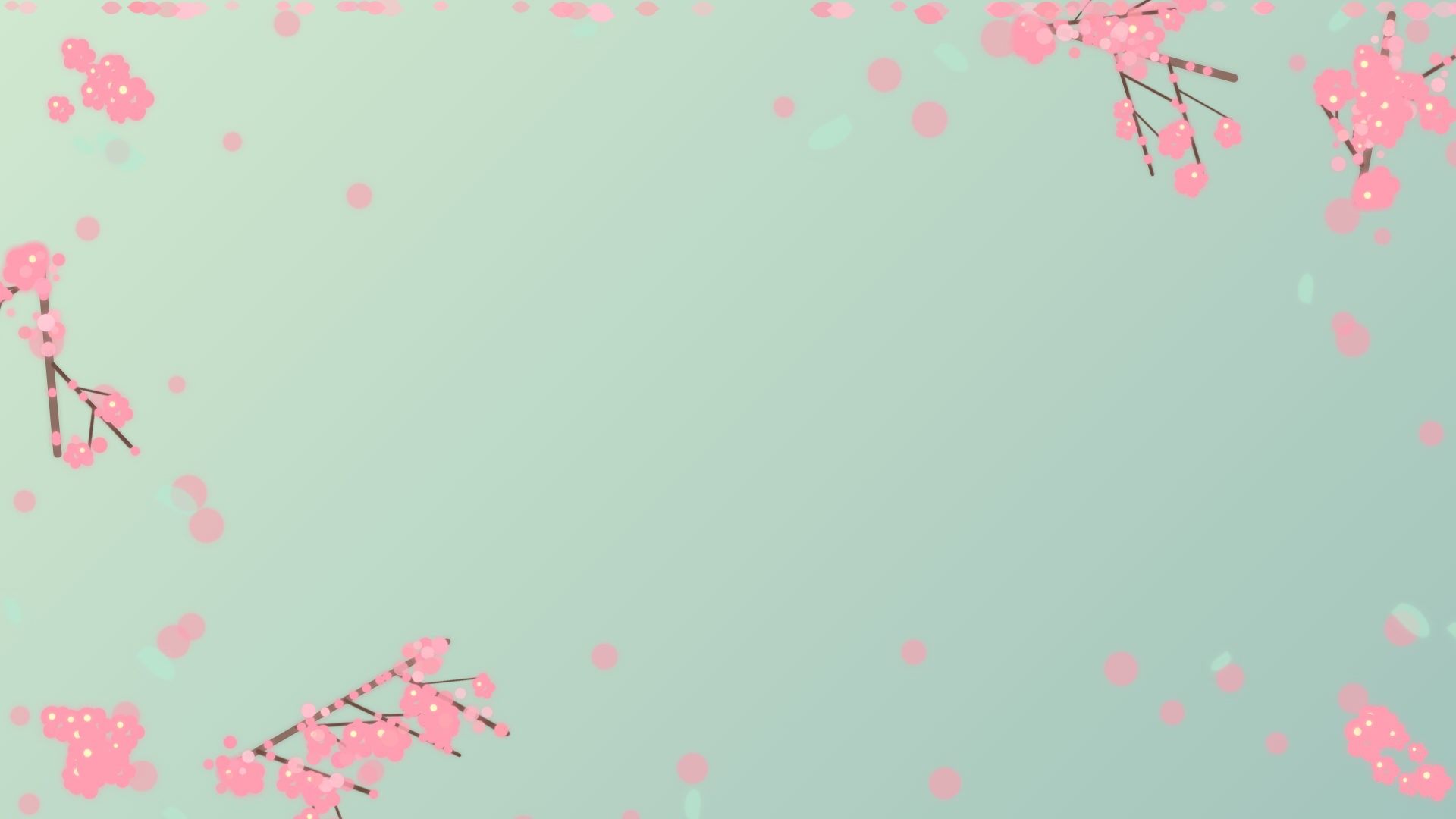
A gentle animated background featuring falling sakura petals and detailed blooming branches, designed to create a calming and visually appealing backdrop for your streams. This background is designed to be used as a base layer beneath other transparent overlays for a complete spring-themed streaming aesthetic.
Features
- Animated falling sakura petals with varied animation patterns
- Detailed branching structures adorned with cherry blossoms
- Blooming flower clusters that add depth and visual interest
- Soft pastel color palette with soothing pink and green gradients
- Subtle depth and layering effects
Animation Features
Gently Falling Sakura Petals
- Realistic petal shapes with subtle color variations
- Smooth falling animation with natural swaying motion
- Petals rotate and drift as they fall, mimicking real sakura
- Variable speeds and sizes for a more natural appearance
Blooming Branch Structures
- Detailed multi-layered branch structures with main branches, sub-branches, and twigs
- Cherry blossom clusters positioned along branches with soft glow effects
- Flower buds and blooms strategically placed for a lush spring appearance
- Natural branching patterns that frame the edge of your content
Customizable Animation Settings
You can adjust the animation by modifying these CSS properties in the :root section:
For Falling Sakura Petals Animation:
--petal-count: Number of petals (default: 60). Increase for more density, decrease for fewer petals.--petal-min-size: Minimum petal size (default: 15px). Adjust the minimum size of the falling petals.--petal-max-size: Maximum petal size (default: 30px). Adjust the maximum size of the falling petals.--petal-min-duration: Minimum fall duration (default: 10s). Adjust for faster or slower falling petals.--petal-max-duration: Maximum fall duration (default: 30s). Adjust for faster or slower falling petals.
For Branch and Blossom Elements:
--branch-color-1: Main branch color (default: #8d6e63). Adjust for different branch colors.--branch-color-2: Secondary branch color (default: #6d4c41). Adjust for different twig colors.--accent-color: Cherry blossom pink color (default: #ff9eb1). Adjust for different flower colors.--accent-color-2: Soft mint green color (default: #b6e9d1). Adjust for different leaf colors.
For Spring Elements Animation (Edge Decorations):
--edge-animation-duration: Animation duration for spring elements (default: 15s for float, 8s for sway). Adjust for faster or slower floating and swaying motion of edge elements.--edge-element-opacity: Opacity of edge elements (default: 0.6). Adjust for more or less prominent edge decorations.--edge-blur-filter: Blur filter for edge elements (default: 1px). Adjust for softer or sharper edge decorations.
Layered Animation Effect
- Background elements remain with gentle floating motion
- Cherry blossom clusters pulse subtly to simulate blooming
- Foreground falling petals create depth and visual interest
- All animations carefully designed to avoid being distracting
How It Works
This overlay uses several techniques to create a gentle and visually appealing animated background:
-
Branch Structures: Detailed branch structures with sub-branches and twigs are positioned around the edges of the screen. These branches serve as supports for flowers, buds, and blossom clusters.
-
Cherry Blossom Clusters: Multiple cherry blossom clusters are placed along the branches, each with a subtle pulsing animation to simulate blooming. These clusters vary in size and density.
-
Edge Decorations (Spring Elements): Around the edges of the screen, spring-themed elements like cherry blossoms and leaves are placed. These elements have subtle floating animations to add gentle motion.
-
Falling Sakura Petals: A layer of continuously falling sakura petals is added across the entire screen. Each petal is dynamically created with randomized properties for size, speed, rotation, and slight color variation to create a natural and varied falling effect.
-
Clear Middle Area: The central area of the overlay is intentionally kept mostly clear. This is to ensure that the background does not obstruct the main content of your stream, such as the game content or camera feed.
- CSS Animations: Multiple CSS animations are used to control the movement of the elements, providing smooth and efficient animation performance:
@keyframes floatand@keyframes swayfor edge elements@keyframes falling-petalfor sakura petals@keyframes gentle-pulsefor the blooming effect on cherry blossom clusters
- JavaScript Initialization: JavaScript is used to dynamically create and position all elements when the page loads, ensuring a randomized and unique layout each time the overlay is used.
Customization Options
You can adjust the animation by modifying these properties in the :root section:
/* Primary colors */
--accent-color: #ff9eb1;    /* Cherry blossom pink */
--accent-color-2: #b6e9d1;  /* Soft mint green */

/* Background colors */
--bg-color-1: #d0e8cf;      /* Light, serene green */
--bg-color-2: #a3c4bc;      /* Soft, muted green */

/* Branch colors */
--branch-color-1: #8d6e63;  /* Main branch color */
--branch-color-2: #6d4c41;  /* Secondary branch color */

/* Sakura animation settings */
--petal-count: 60;          /* Number of falling petals */
--petal-min-size: 15px;     /* Minimum petal size */
--petal-max-size: 30px;     /* Maximum petal size */
--petal-min-duration: 10s;  /* Minimum fall duration */
--petal-max-duration: 30s;  /* Maximum fall duration */

/* Edge decoration settings */
--edge-width: 200px;        /* Width of the edge decorations */
--center-clear-zone: 1200px; /* Size of the clear zone in the middle */
Customization Guide
Changing Colors
To modify the color scheme of the background:
- Background Colors: Find the
.backgroundCSS class and modify thebackgroundproperty:.background { /* Change these gradient colors for a different sky effect */ background: linear-gradient(135deg, var(--bg-color-1), var(--bg-color-2)); }You can customize the following CSS variables in the
:rootto change the background colors:--bg-color-1: Light, serene green background color.--bg-color-2: Soft, muted green background color.
- Sakura Petal Color: Find the
.cherry-blossomCSS class and adjust thebackground-colorproperty:.cherry-blossom { /* Modify this color for different sakura petal colors */ background-color: var(--accent-color); }Customize the
--accent-colorCSS variable in the:rootto change the sakura petal color. - Branch Colors: Adjust the branch colors using the
--branch-color-1and--branch-color-2variables:.branch-segment { background-color: var(--branch-color-1); } .sub-branch, .twig { background-color: var(--branch-color-2); }
Adjusting Animations
- Falling Petal Animation:
- Petal Count: Control the number of falling petals using the
--petal-countCSS variable. - Petal Size: Adjust the size range of falling petals with
--petal-min-sizeand--petal-max-size. - Fall Speed: Modify the falling speed by changing
--petal-min-durationand--petal-max-duration. Shorter durations mean faster falling.
- Petal Count: Control the number of falling petals using the
- Blossom Cluster Animation:
- Pulse Animation: The gentle pulsing of cherry blossom clusters is controlled by the
@keyframes gentle-pulseanimation. You can adjust the timing in the animation declaration:blossom.style.animation = `gentle-pulse ${3 + Math.random() * 2}s infinite ease-in-out`;
- Pulse Animation: The gentle pulsing of cherry blossom clusters is controlled by the
- Spring Element Animation:
-
Float Animation: The floating animation of spring elements is controlled by the
animation-durationin the@keyframes floatanimation applied to.spring-element. Adjust theanimation-durationin the.spring-elementstyle to change the speed..spring-element { /* ... other styles ... */ animation: float 15s infinite ease-in-out; /* Adjust '15s' for speed */ } -
Sway Animation: The sway of leaves is controlled by the
@keyframes swayanimation applied to.leaf. Adjust theanimation-durationin the.leafstyle to change the sway speed..leaf { /* ... other styles ... */ animation: float 25s infinite ease-in-out, sway 8s infinite ease-in-out; /* Adjust '8s' for sway speed */ }
-
Adjusting Branch Density and Blossom Clusters
-
Branch Count and Position: The number and position of main branches are defined in the
createDetailedBranches()function:// Reduced number of branches - only 4 total (one on each edge) // Top edge branch createBranchStructure('70%', '2%', '15deg', 300); // Bottom edge branch createBranchStructure('15%', '94%', '-30deg', 350); // Left edge branch createBranchStructure('3%', '30%', '85deg', 280); // Right edge branch createBranchStructure('93%', '25%', '-80deg', 260);You can add more branches by adding more
createBranchStructure()calls with different positions. -
Blossom Cluster Density: The number of blossom clusters on each branch is controlled in several places:
// On main branches
const blossomClusterCount = 3 + Math.floor(Math.random() * 3); // 3-5 clusters

// On sub-branches (40% chance)
if (Math.random() > 0.4) {
    const blossomClusterCount = 1 + Math.floor(Math.random() * 2);
}

// On twig ends (40% chance)
if (Math.random() > 0.6) {
    createBlossomCluster(twig, 0.9);
}
Adjust these numbers and probabilities to increase or decrease the density of blossoms.
Adding or Removing Elements
-
Sakura Petals: The number of sakura petals is controlled by the
--petal-countvariable:--petal-count: 60; /* Change to adjust falling petal count */ -
Background Blossoms: The number of background blossoms is controlled by the loop in the Javascript function
createSpringElements():// Create cherry blossoms - only around the edges for (let i = 0; i < 45; i++) { // Change '45' to adjust background blossom count // ... blossom creation code ... } -
Leaves: Similarly, the number of leaves is controlled by the loop for leaf creation in
createSpringElements():// Create leaves - only around the edges for (let i = 0; i < 15; i++) { // Change '15' to adjust leaf count // ... leaf creation code ... }
Integrating with Other Overlays
This background is designed to work as a base layer. To use it with other overlays:
- Add this background as a browser source in your streaming software.
- Add your game capture or other content source above it.
- Add transparent foreground overlays on top.
For best results, use with other overlays from this collection that have transparent backgrounds.
Advanced Customization
For more advanced customization, you can:
- Adjust the opacity values in various elements to make them more or less prominent.
- Modify the animation keyframes for completely different movement patterns.
- Add new decorative elements by creating additional CSS classes and HTML elements.
- Customize the branch structures by modifying the functions:
createDetailedBranches(): Controls the number and position of main branchescreateBranchStructure(): Controls the structure of each main branchcreateSubBranch(): Controls the sub-branchescreateTwig(): Controls the smallest branch elementscreateBlossomCluster(): Creates and positions cherry blossom clusters
Questions or Issues?
If you have any questions about customizing this overlay or encounter any issues, please open an issue in the GitHub repository.